Expedia Flight Results Page
Content Strategy
Wendy (Hsin-Hui) Cheng, Conner Garrison, Chenchen Gu, Yijin Kim, Bradley Paynter
Strategy Doc | Implementation Plan | Deck | Wireframes
Overview
As part of our degree program, we examined a small aspect of Expedia’s desktop website: the flights search results page. We conducted content, mobile and accessibility audits, made new strategy recommendations and presented prototypes to visualize the strategy.


Problem
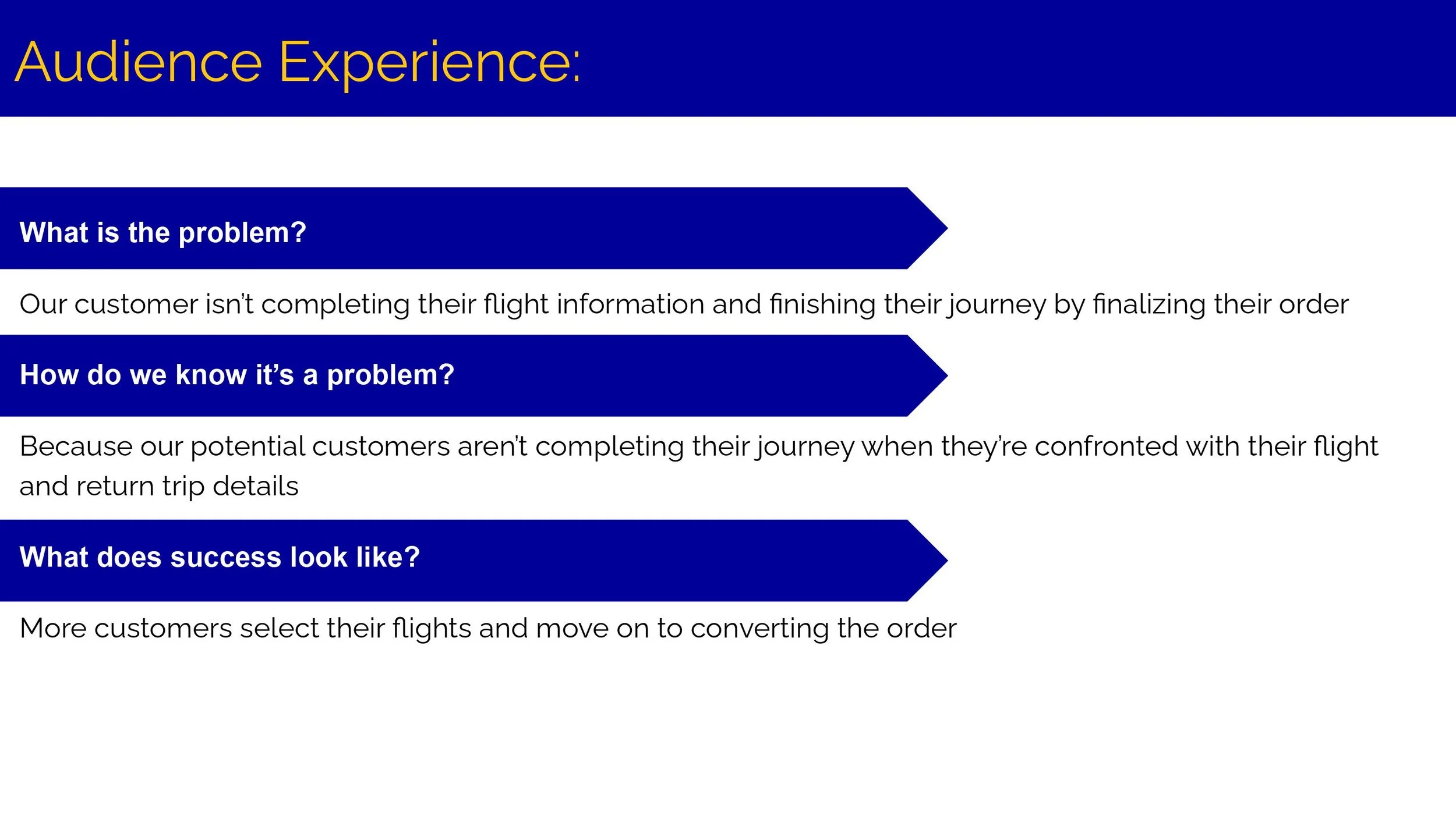
In an effort to be the expert that works for its audience, search results overwhelm the audience and prevents them from having a positive experience at each stage of their flight-booking journey.
Project Goal
Help users find their preferred options quicker and move them towards making a purchase.
Desired Result
The change in strategy will show
Conversion increase as abandon rates decrease
Improved user experience with less content
Unambiguous call to action increases user response
User moves quickly through the site
HYPOTHESIS
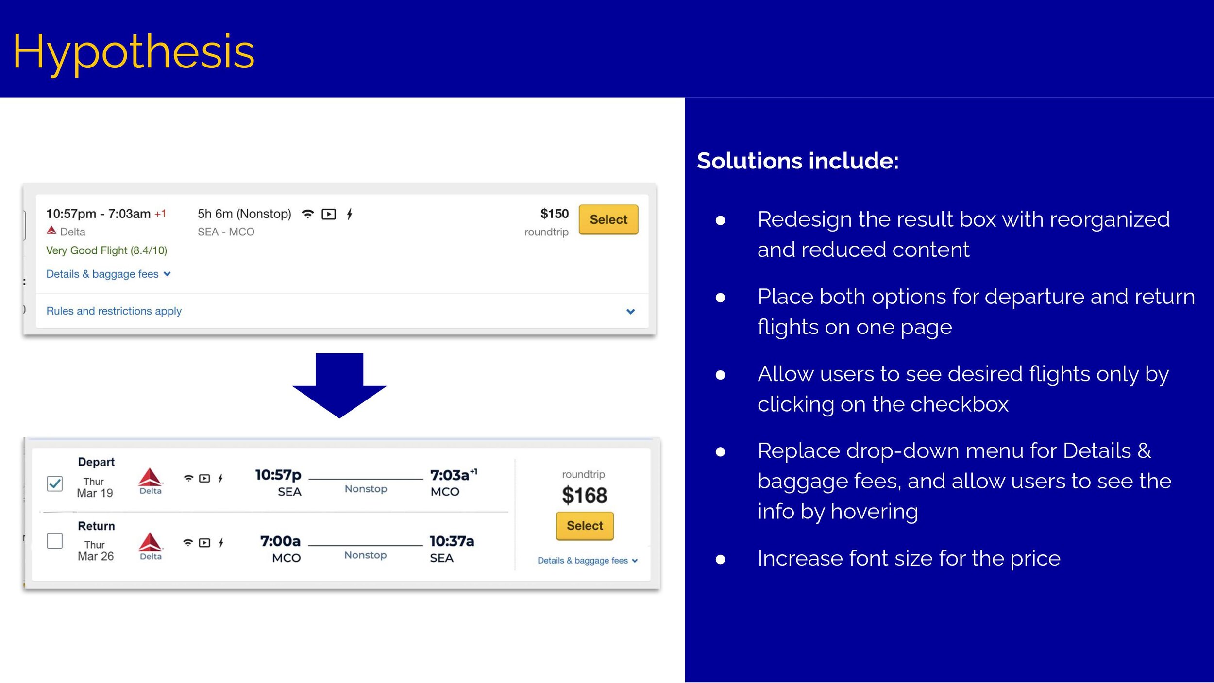
If Expedia reduces the amount of flight information and combines the current two pages for selecting flights into one page
Then, customers can find their desired flights more quickly and more customers will move to the next step, the purchase page.
Because they can look through the flight information more easily.
RECOMMENDATIONS
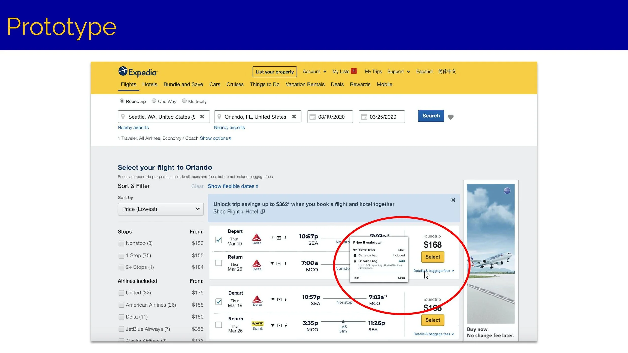
Redesign the result box with reorganized and reduced content
Place both options for departure and return flights on one page
Allow users to see desired flights only by clicking on the checkbox
Replace drop-down menu for Details & baggage fees, and allow users to see the info by hovering
Increase font size for the price
MEASURING SUCCESS
Reducing content on the Flights Search Results page helps users locate their preferred option and moves them towards completing their reservation.
Track progress through these measurements:
Click-through rate,
Time on page,
Bounce rate and abandonment count.
If the number of exits increases, reduce the loading time so users can quickly view results.